Visualizing 13 million Bluesky users
Joel Gustafson / Posts / 2024-11-12
Anyone who uses Twitter a lot knows that it's a big place. Not just that it has a lot of active users, but more that there are lots of different parts.
Over time, everybody develops their own mental map of the landscape, infering how vast and foreign the whole network is from hints and clues, stray tweets escaping containment, and chance encounters in a big account's replies. But we never get to see the whole thing for real.
We can't make a map of all of Twitter, because the data isn't available and scraping it would be difficult and illegal. But we can do it for BlueSky, which has seen massive growth over the last several months thanks to Twitter's ongoing antagonization of its userbase and Brazil banning Twitter outright in October 2024.
Here's a sneak peek at the final result.
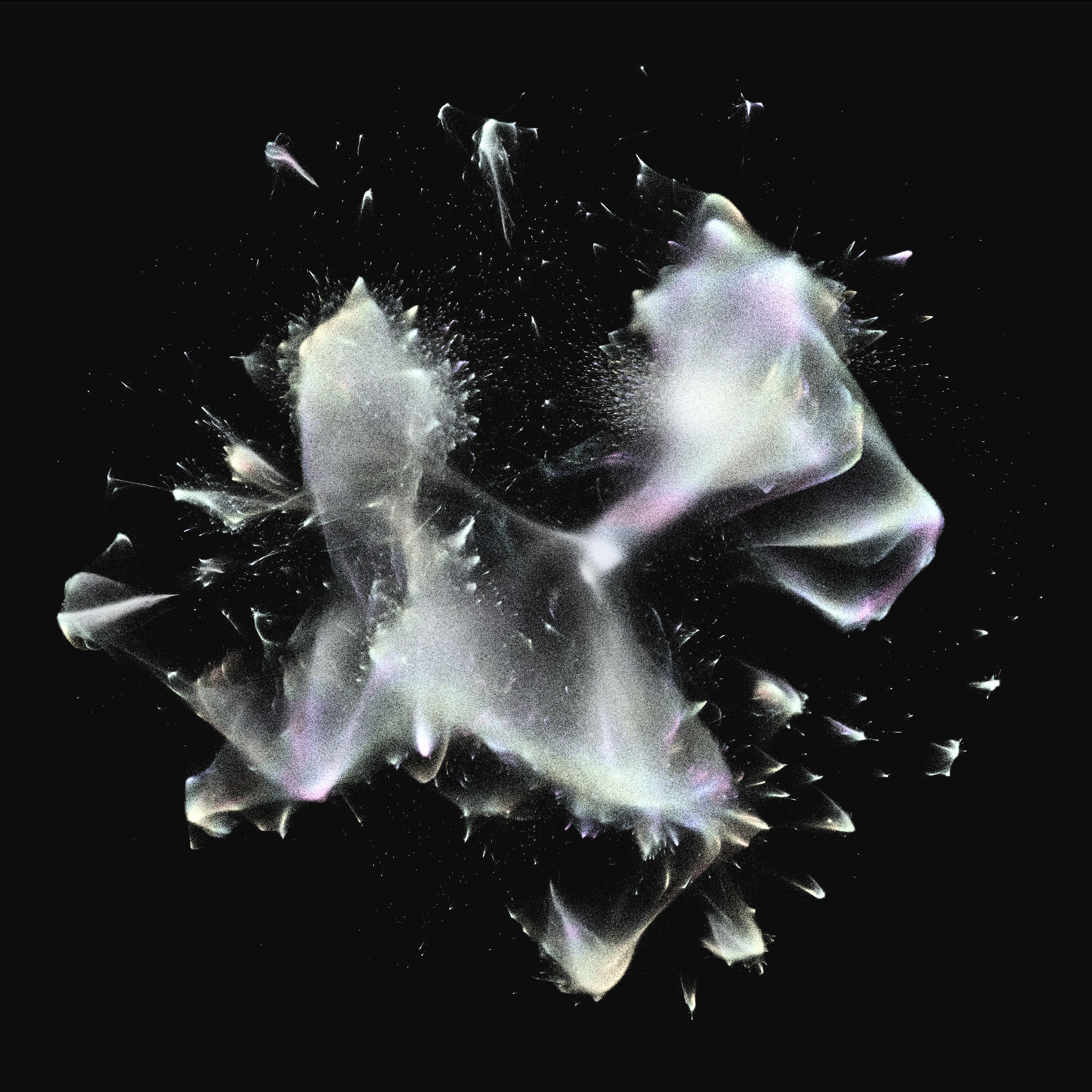
You can also explore the map interactively at https://aurora.ndimensional.xyz, although you'll need desktop Chrome/Chromium since it uses WebGPU.
The first step is getting the data. To keep things manageable, I'm just working with the follow graph. In this graph, each follow is treated like a single undirected edge, so "mutuals" have two edges between them that essentially weight the edge double.
BlueSky is build on the AT protocol, designed to realistically support anyone who wants to self-host their own data on their own PDS (personal data server). But all we really care about for this project is the WebSocket firehose exposed by the "relay" service bsky.network that the BlueSky team runs, which aggregates all the events from the main *.bksy.social PDS, and also every independent PDS who asks to be indexed. We can just open a WebSocket and see every type of event streaming in from the entire network in real time, currently around 500 events per second. We filter this down to follows and unfollows, and store it all in a local SQLite database.
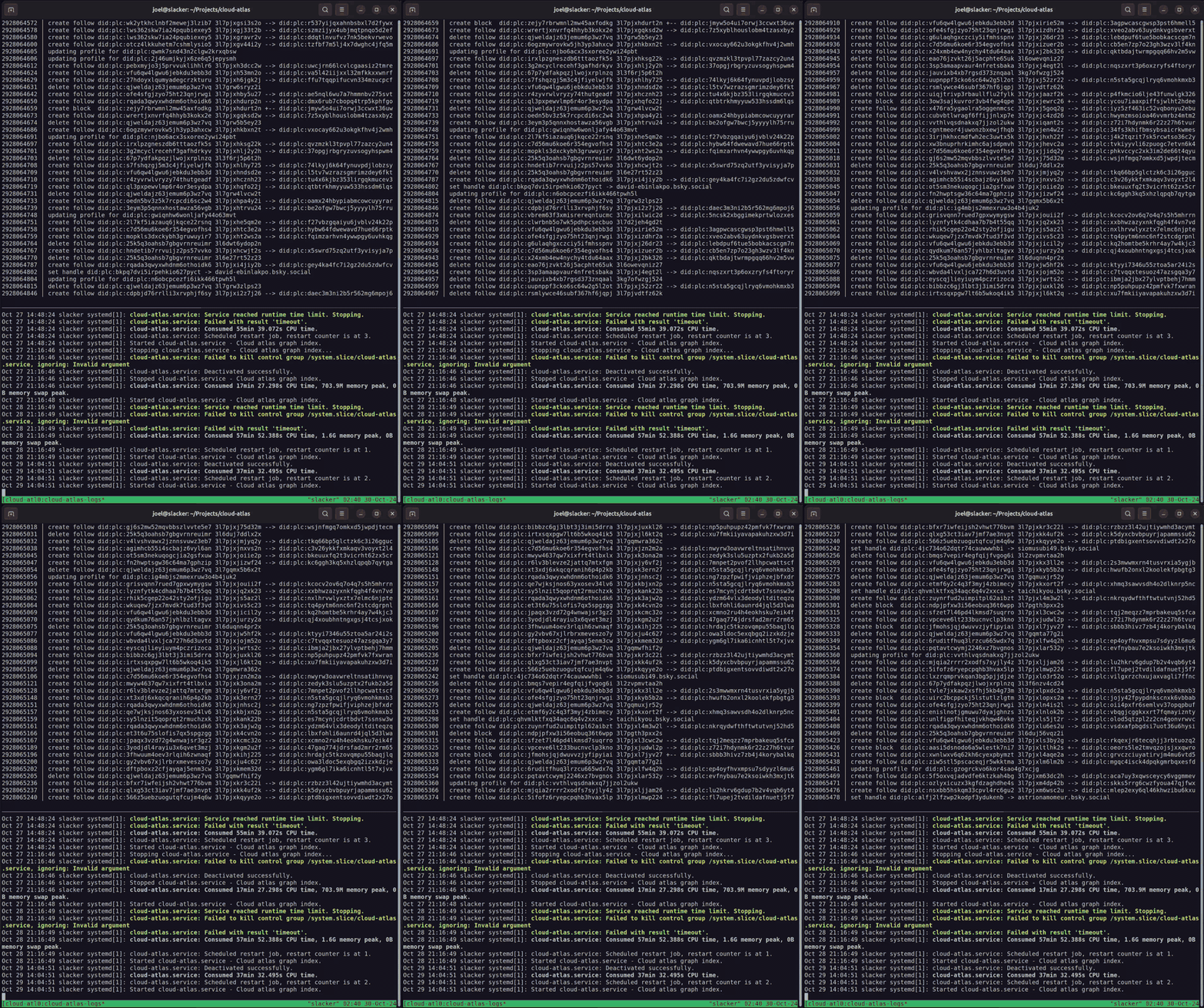
At first, last year, I set up a fancy system where I deployed the indexer to fly.io, and configured it to replicate the database in realtime to an AWS S3 bucket using litestream. But that was a little over-engineered, and surprisingly expensive to run (my Fly bill was $40/month), so I shut it down and switched to running it entirely on my home server. I installed the indexer as a systemd service, and configured logrotate and a tmux monitor to let me ssh in through TailScale and watch the event stream live from anywhere.
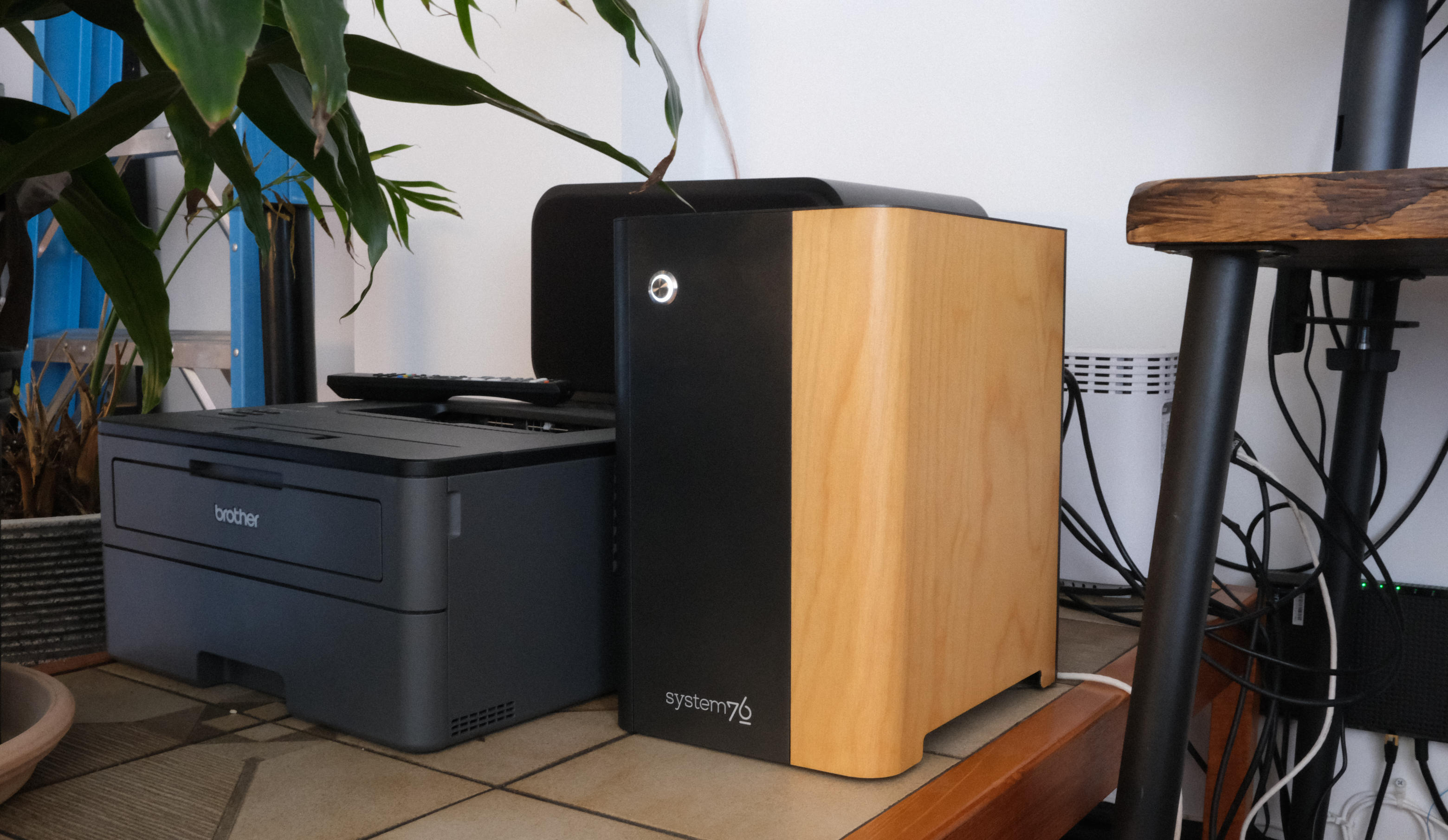
Everything described in this entire post happens on this System76 desktop in my apartment. Brother HL-L2350DW for scale.
How much data is there? BlueSky is growing quickly, but at the time of writing, it recently passed 13 million users, and the follows table had a little over half a billion rows, which was only around 30 GB on disk.
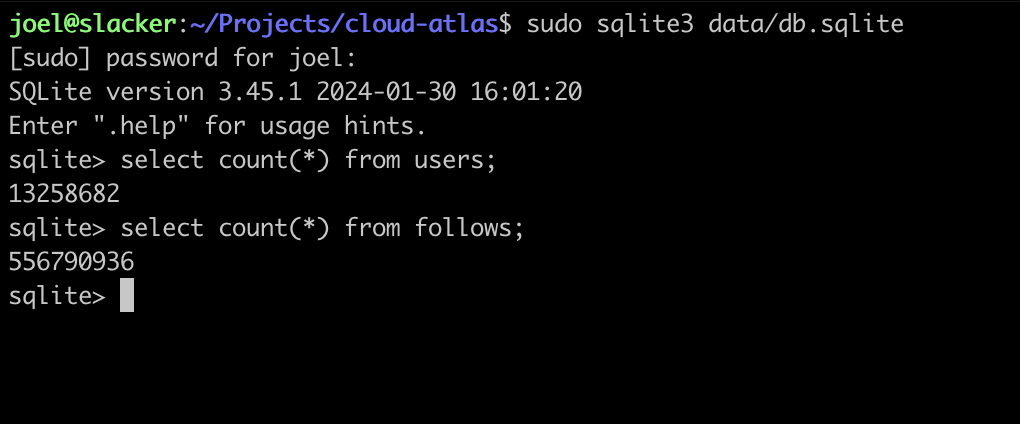
How do you render a graph of 13 million nodes and half a billion edges?
Graph layout has an entire field of research behind it. Some algorithms are designed for visually appealing diagrams, like dagre or the ones that GraphViz uses. But of course the "classical" way to do this is with a force-directed layout. I remember seeing them first in the D3 examples.
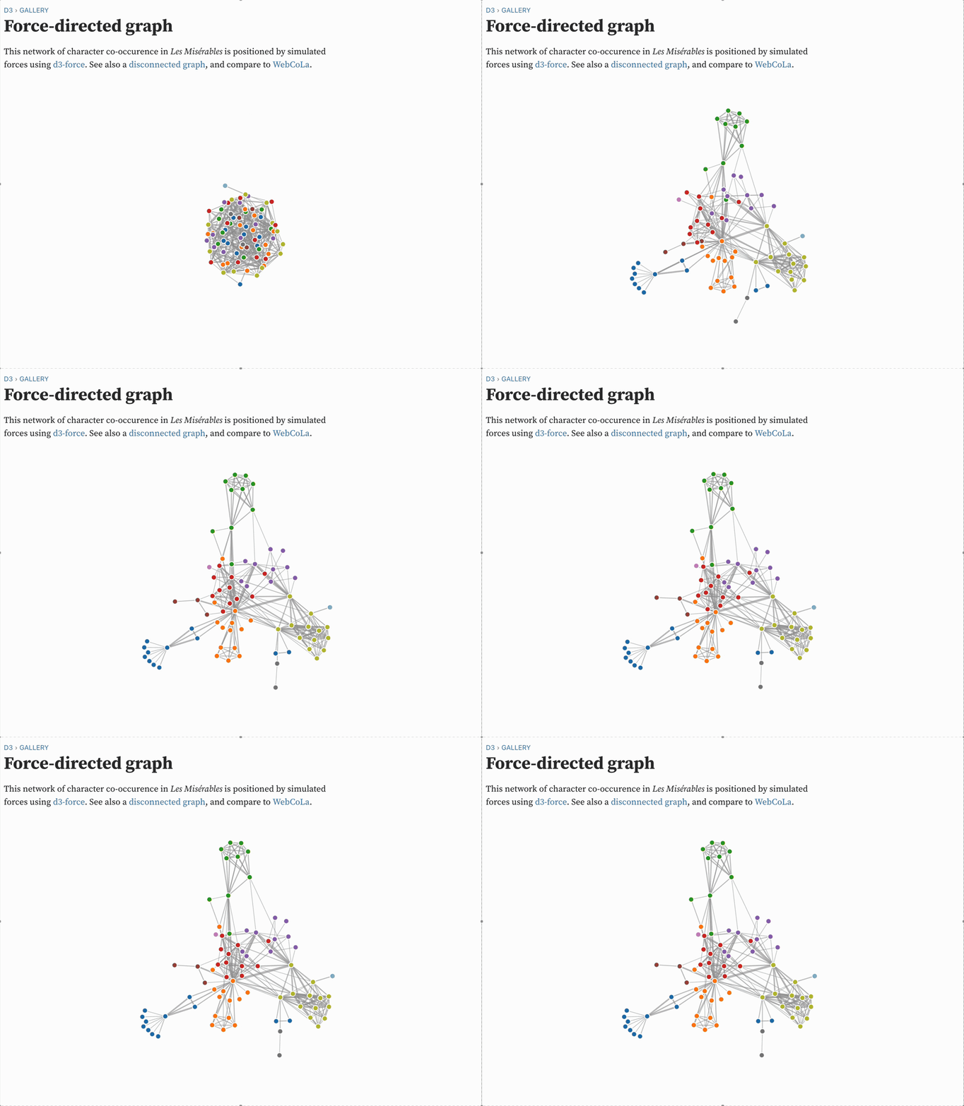
Force-directed graph layout is essentially a physics simulation: you pretend that every node exterts a repulsive force on every other node, and that edges induce an attractive force between the source and target. Typically, the repulsive force decreases quadratically with distance, like a magnet, and the attractive force increases linearly with distance, like a spring. On every "tick" of the simulation, you compute the net force on every node, and then move each node by its net force vector scaled by some global "temperature" parameter.
Computing these ticks is slow. The issue isn't the literal size of the graph - 500 million edges can easily fit in memory if they're just [f32, f32] tuples - but the computational complexity of the n-body problem.
The core issue is that since every node repells every other node, the naive algorithm for a single simulation tick is O(n^2) + O(e) (for n nodes and e edges). This is a non-starter for graphs with millions of nodes, even for a GPU. Instead, every force-directed graph engine uses the Barnes-Hut optimization, which reduces this to O(n log(n)) + O(e) at the expense of approximating the effects of distant nodes.
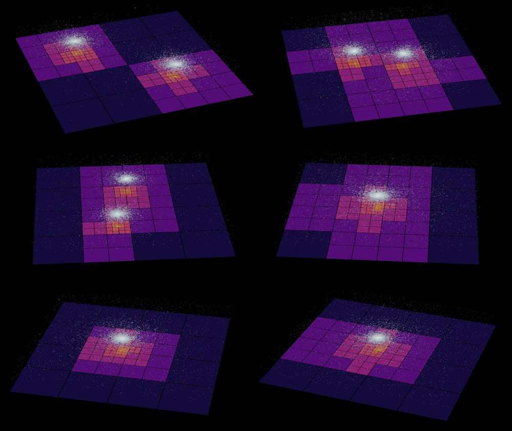
Building and querying the quadtree is intrinsically heirarchical, which means the node forces can't easily be computed on the GPU. Still, we can parallelize things as much as possible. The quadtree can be split up into 4 or 16 quadtrees, each rebuilt in parallel at the beginning of each tick. And then computing the forces can be parallelized arbitrarily by giving each thread in the pool a range of nodes to process. Each node's net force is the sum of the forces exerted on it by each of the quadtrees (computing this for a given node is just O(log(n))), and the forces exterted on it by all of its incoming and outgoing edges. We can utilize all available CPU with essentially zero overhead.
I made a little multithreaded engine for force-directed graph layout in Zig, made a GUI using GTK4 and OpenGL, and named it Andromeda.
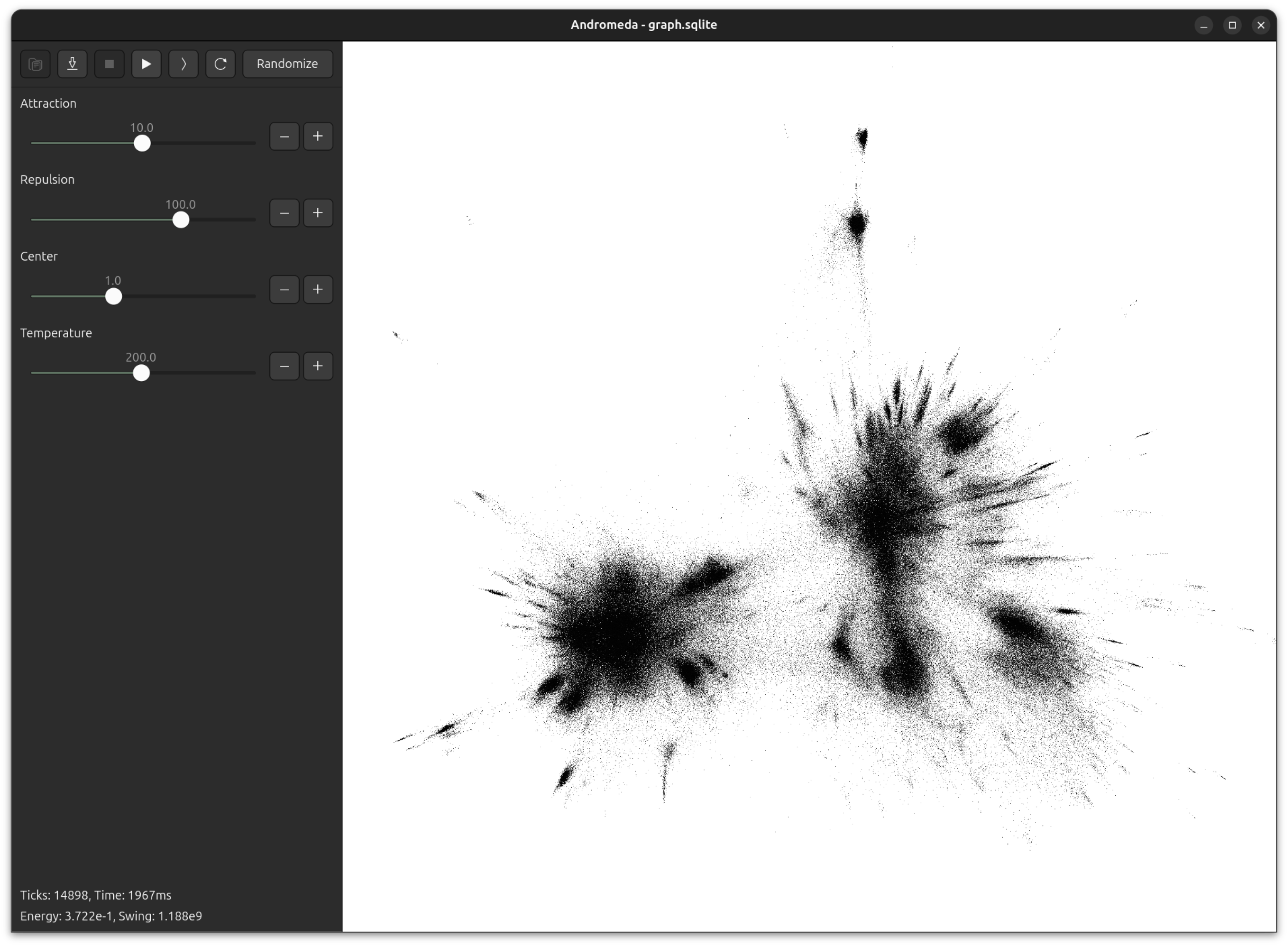
Andromeda is largely inspired by Gephi and the ForceAtlas2 paper. The authors are keen to emphasize the importance of interactivity for working with large scale graph visualization - you need to be able to watch the graph evolving, and dynamically adjust the simulation parameters. You just don't get good results if your tools are opaque and have long iteration times.
Here's Andromeda running in real-time on a graph of 100,000 nodes.
One of Andromeda's cute features is a UI widget that I call a "natural slider". Often when opening a new graph, or testing a new version of the engine, or adding a new parameter, it's impossible to know ahead of time what a sensible range for the value should be, even to an order of magnitude. Not to worry! With the natural slider, you can dynamically adjust the range by powers of e.
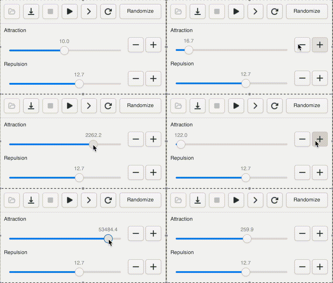
This gives us "natural orders" that fit our intuitive sense of "bigger" and "smaller" while giving easy access to the entire range of positive floats. Powers of 2 are too small, powers of ten are too big.
Unfortunately, force-directed layouts for large social networks leave some things to be desired. Here's Andromeda's ForceAtlas2 layout of a snapshot of 5 million BlueSky users from September 2024:
The result is very "blobby". It clearly shows the mass and density of the major clusters - the "large-scale structure" - but most nodes are just strewn across vast undifferentiated fields in the general orbit of a supercluster. Only a couple dozen small communities, mostly countries, are tight and isolated enough to break off into their own streak.
I published an early version of this back in February, when the graph had just 2 million accounts. A common response was fascination with the global view but disappointment with the local views. The website lets people locate accounts by username, and when people looked themselves up, they didn't recognize the accounts around them, and had to search far and wide for familiar faces.
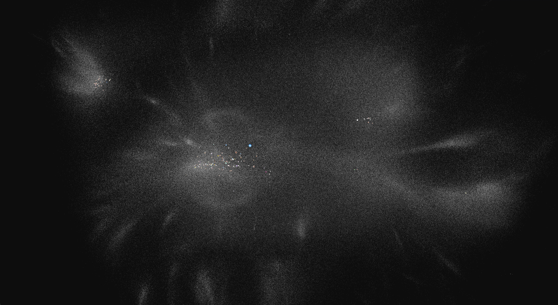
There's naturally going to be pretty severe limitations on what is even possible here. No arrangement of accounts on a 2d plane will feel like it really captures the full topology of how the network is connected. But it felt like it was possible to do better, and that the force-directed approach just wasn't sensitive to local neighborhoods.
Another way of seeing graph layout is as a type of "dimensionality reduction". We're try to take a big 13 million x 13 million adjacency matrix and project it onto a 2-dimensional pane. Naturally, dimensionality reduction has already been a point of interest in the machine learning world, first through linear algebra techniques like PCA and spectral analysis, and more recently through a variety of non-linear techniques. This Wikipedia page has a great survey of them.
The big two that are famous for being shockingly good for 2-dimensional visualizations are t-SNE and UMAP. UMAP is behind several popular visualizations you may have seen on Hacker News or Twitter, like this one of the prime divisors of first million integers.
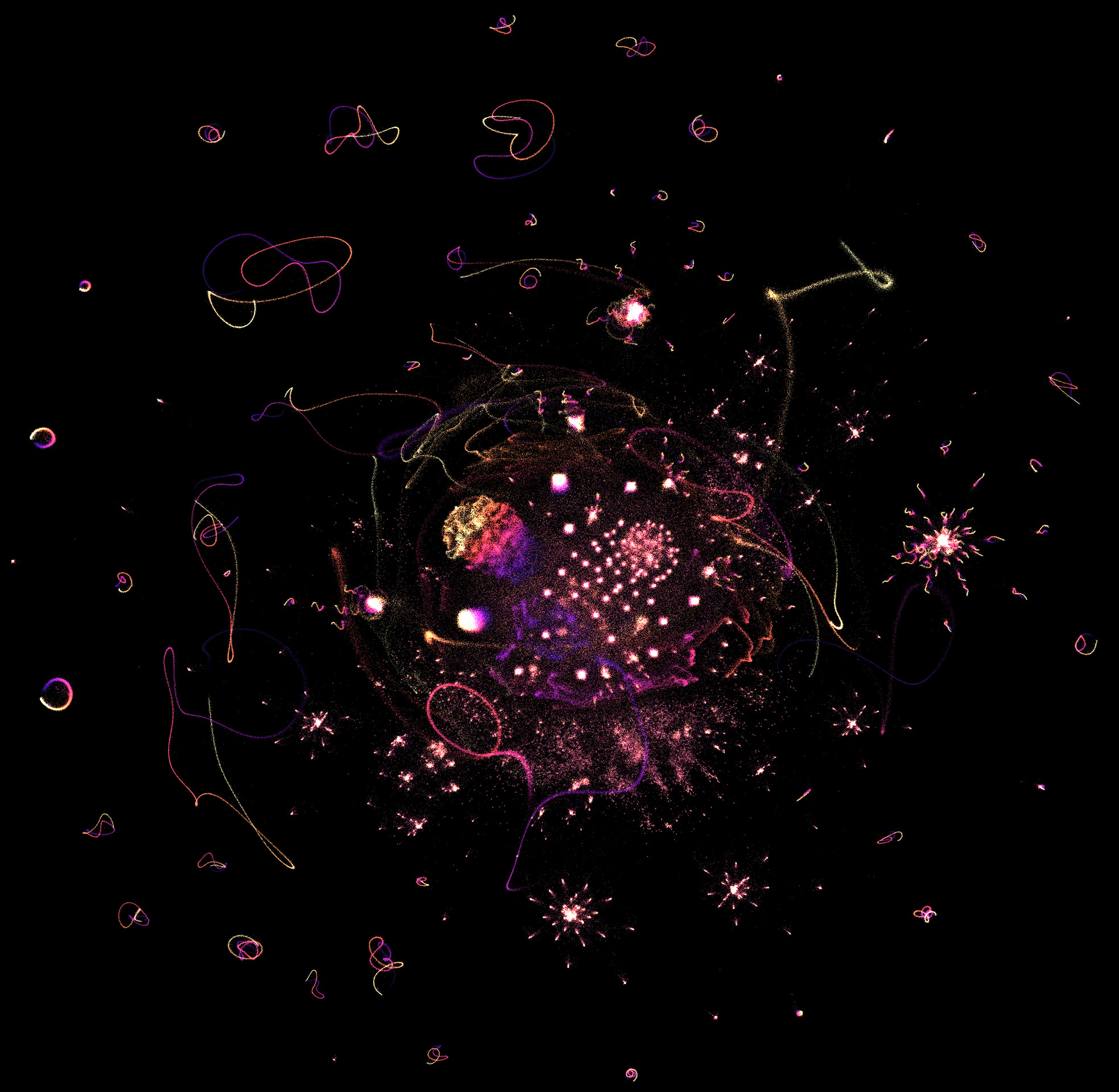
What happens if we throw the BlueSky matrix into UMAP? Well, we can't, at least not directly. Even though UMAP technically accepts sparse matrices, our scale is just to big for my home server. Instead, we can settle for using some other technique to derive embeddings for every user, in a medium-sized dimension like 32, and then feed that into UMAP. Easy!
After a bit of research it looked like this nodevectors repo was the best open-source node embedding toolkit, and the as-of-yet-unpublished GGVec algorithm had the best parallelized performance on huge graphs. I got embeddings for a 5-million-node September snapshot in just 5 minutes, and my first UMAP picture in another 10 minutes.
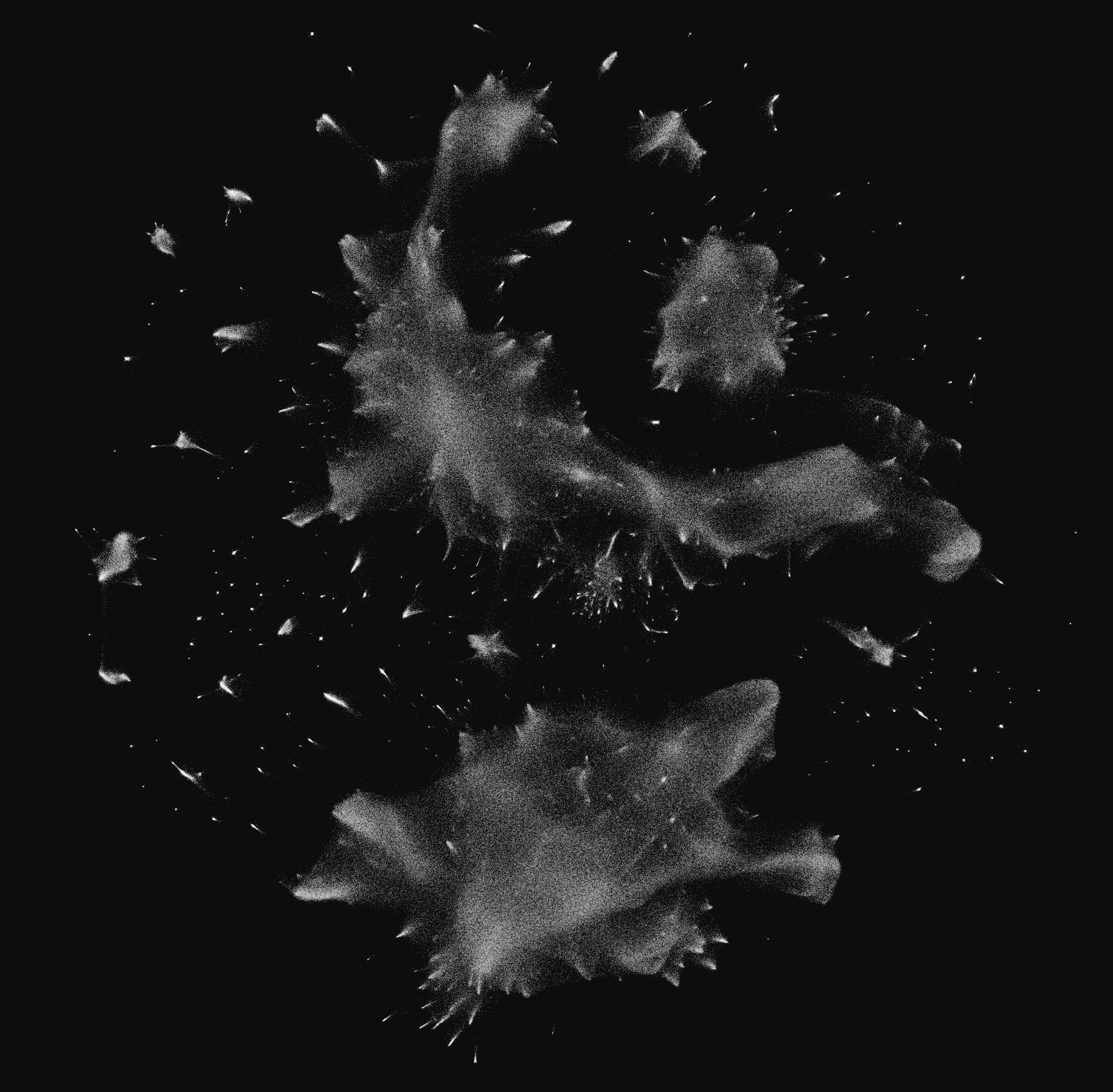
Amazing! Much more intermediate structure than the blobs that Andromeda gave us. Checking on my immediate neighbors, it felt better, although not as good as I had hoped. I wasn't in the immediate vicinity of any of my mutuals, even though the neighborhood felt closer to my "type" of account. Like people from another city in my state, but not my neighbors.
Is it really that hard? Is the graph topology connected in a way that only a tiny fraction of accounts can be placed near their mutuals? Or is all the local detail lost in the embedding, before UMAP? I'm still not sure.
UMAP is really good, but has a couple quirks that aren't ideal for this project. One is that even if you spend days on end fiddling with the parameters, it's impossible to stop UMAP from making some clusters so dense that the points overlap. This behavior is expected and desirable if you want a pure dimensionality reduction where identical points in the source dimension map to the exact same place in the target dimension. But for making a map, I planned on rendering each account's profile picture on their node at close zoom levels, and wanted everyone to have the experience of seeing themselves placed in the big map.
Internally, UMAP actually uses a force-directed graph of its own in its final stage. At a very high level, UMAP works by taking the source embeddings and
- computing a "k-nearest-neighbors graph" where every sample has an edge to each of its
kclosest neighbors by euclidean distance in the embedding dimension - using fancy math to find special weights for these edges
- computing a force-directed layout for the weighed k-nearest-neighbors graph
All of the magic that makes UMAP look good is inside step 2, but computationally it still follows the same outline - nodes repel, edges attract. But UMAP plays it somewhat fast-and-loose with the final step, due to "computational constraints", and uses sampling to doing the force-directed layout. This means not every node actually repels every other node, even in the approximate way that Barnes-Hut does. Only some are randomly selected to interact with each other. So even though the min_dist parameter is supposed to control separation between points, I found it doesn't work very consistently for huge graphs.
Fortunately, I had already developed Andromeda to a point where it was easy to tweak the repulsive force equation, plug the UMAP output in, and run the simulation for a few ticks to "smooth out" the overlapping points.
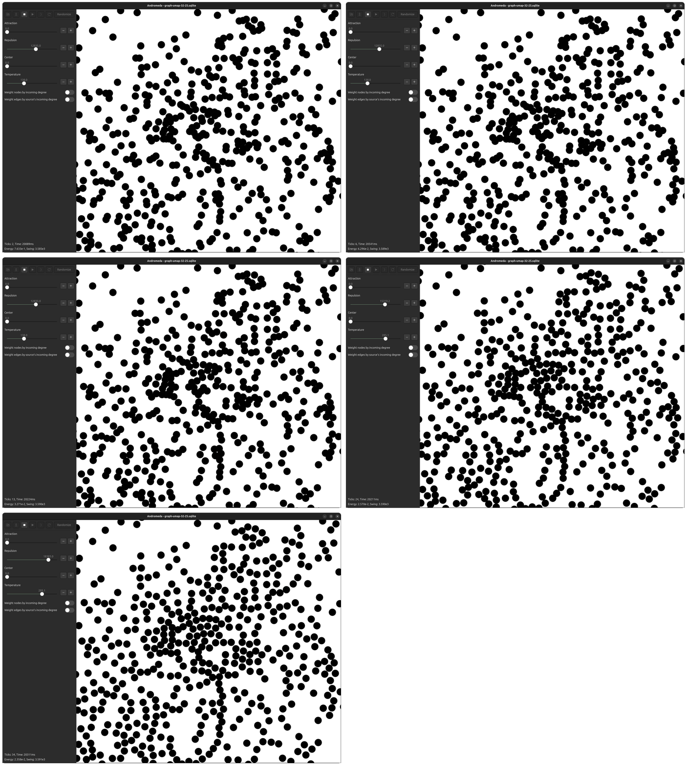
Now, even in the most dense clusters, nodes are packed perfectly without layering.
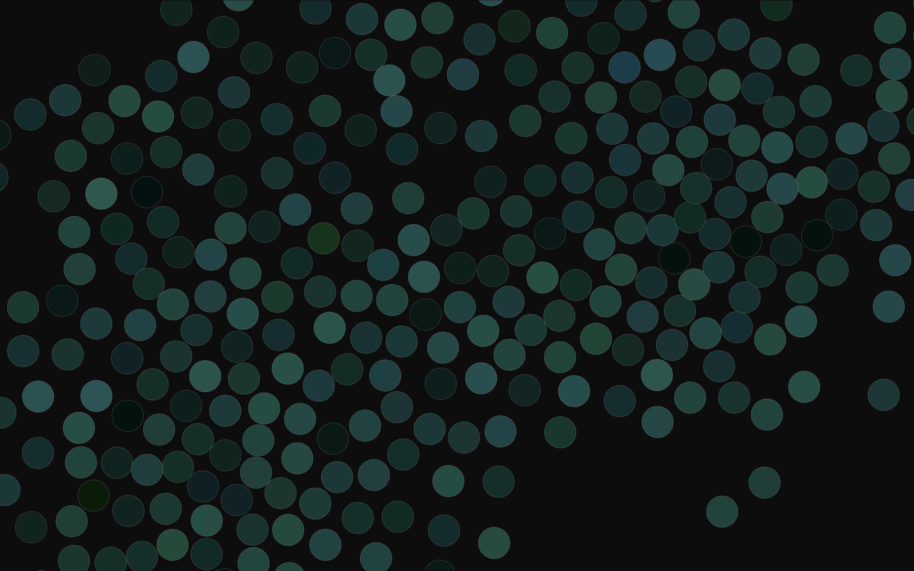
Ideally I would love to get access to the raw weights of the graph that UMAP constructs, and use them in Andromeda directly, with the force equations from the UMAP paper but using Andromeda's parallelized quadtree, and see if the layout looks any different. I'll try to do this for the next version.
Can we add color to this?
One approach is to apply clustering algorithms like HDBScan directly to the UMAP output, and color the clusters...

... but color also represents an opportunity to add another dimension of information, however small. UMAP is forced to superimpose separate clusters at times, so coloring nodes with a hue derived independently from the embedding space could help visually disambiguate them. The UMAP documentation has an example of doing PCA on the embedding space, and using the first three components for RGB values to color points for plotting. This is good for diagnostics, but isn't particularly visually appealing.
After a few rounds of design iteration, I settled on a process that computes a k-means clustering in the embedding space, assigns hues to each cluster, and then interpolates hues for points using their three nearest cluster centers. I found that this highlights more local struture than PCA, smoothly transitions in the embedding dimension, and gives the map a soothing, dappled, stained-glass texture up-close.
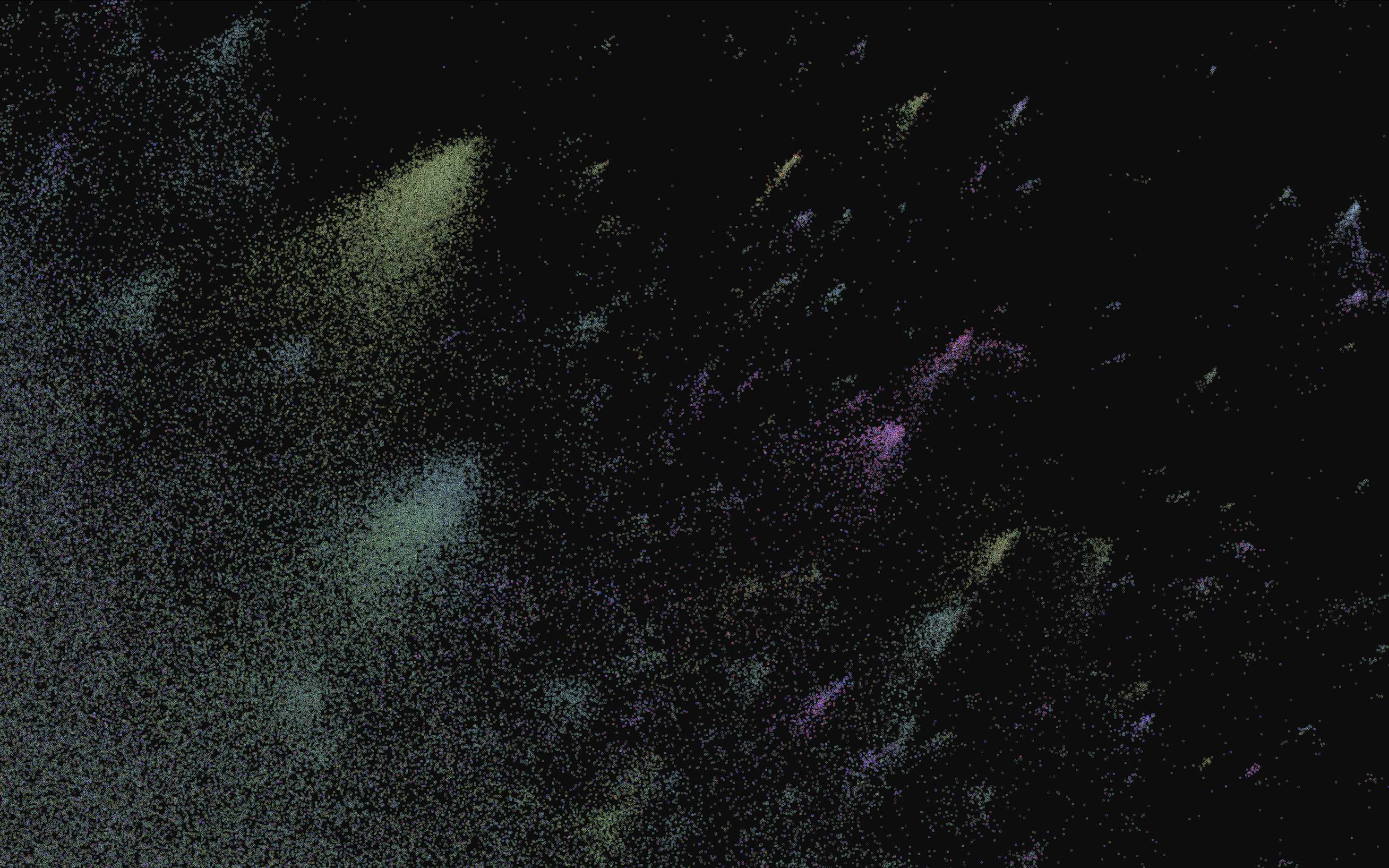
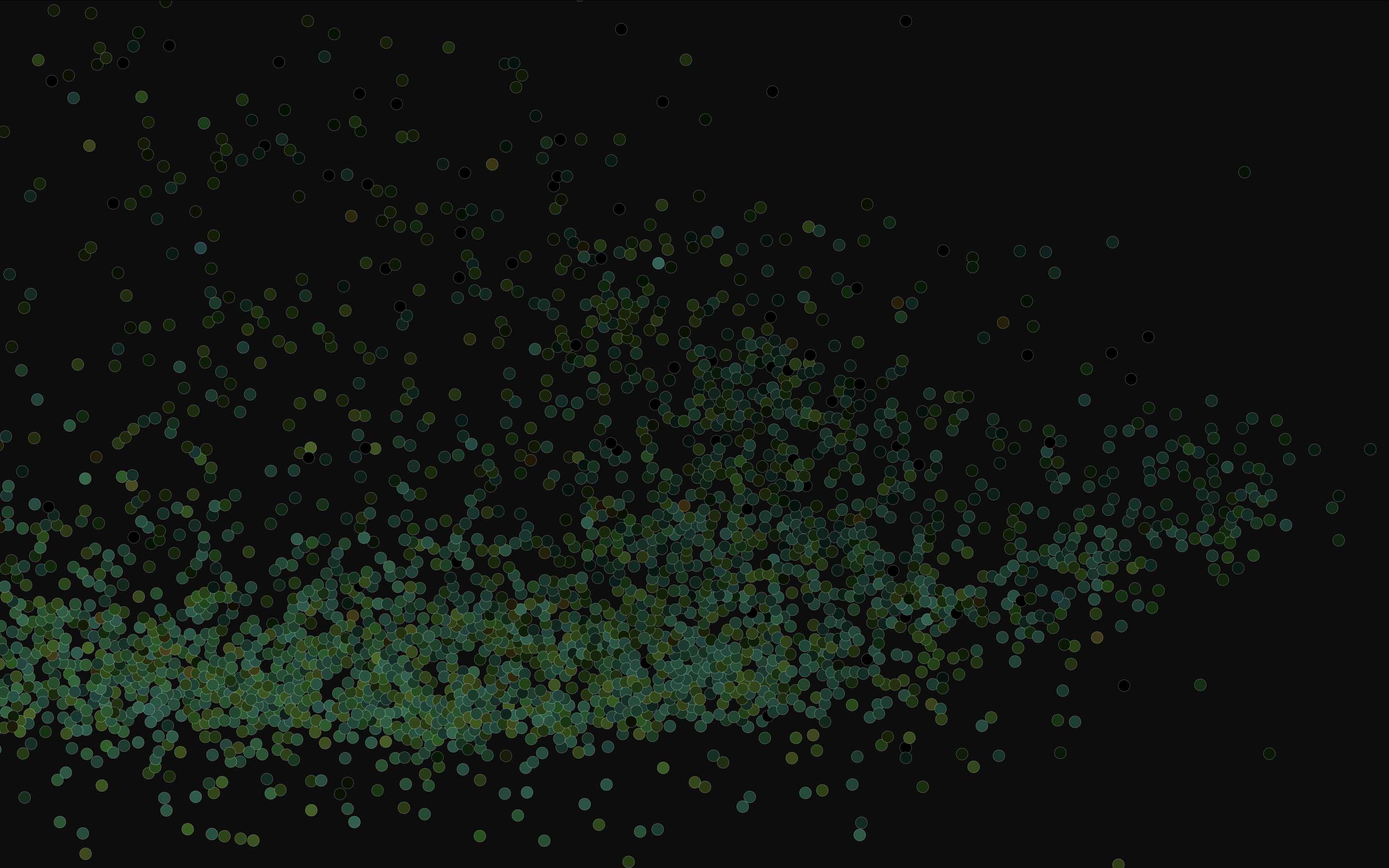
These hues are just single floats from 0 to 1, which I map to rgb using the hsluv color space. Saturation for every node is constant, to give the visualization some consistent visual identity. And lightness is scaled using the log10 of each user's follower count, so that large accounts appear as bright stars and lowbies appear muted. I had originally tried to render large accounts literally larger, but that turned out way too visually cluttered for large graphs.
Here's the full network as of 2024-11-07. I filtered out accounts that follow more than 50k accounts, or follow less than 5 accounts and have less than 5 followers, leaving 7.7 million nodes.
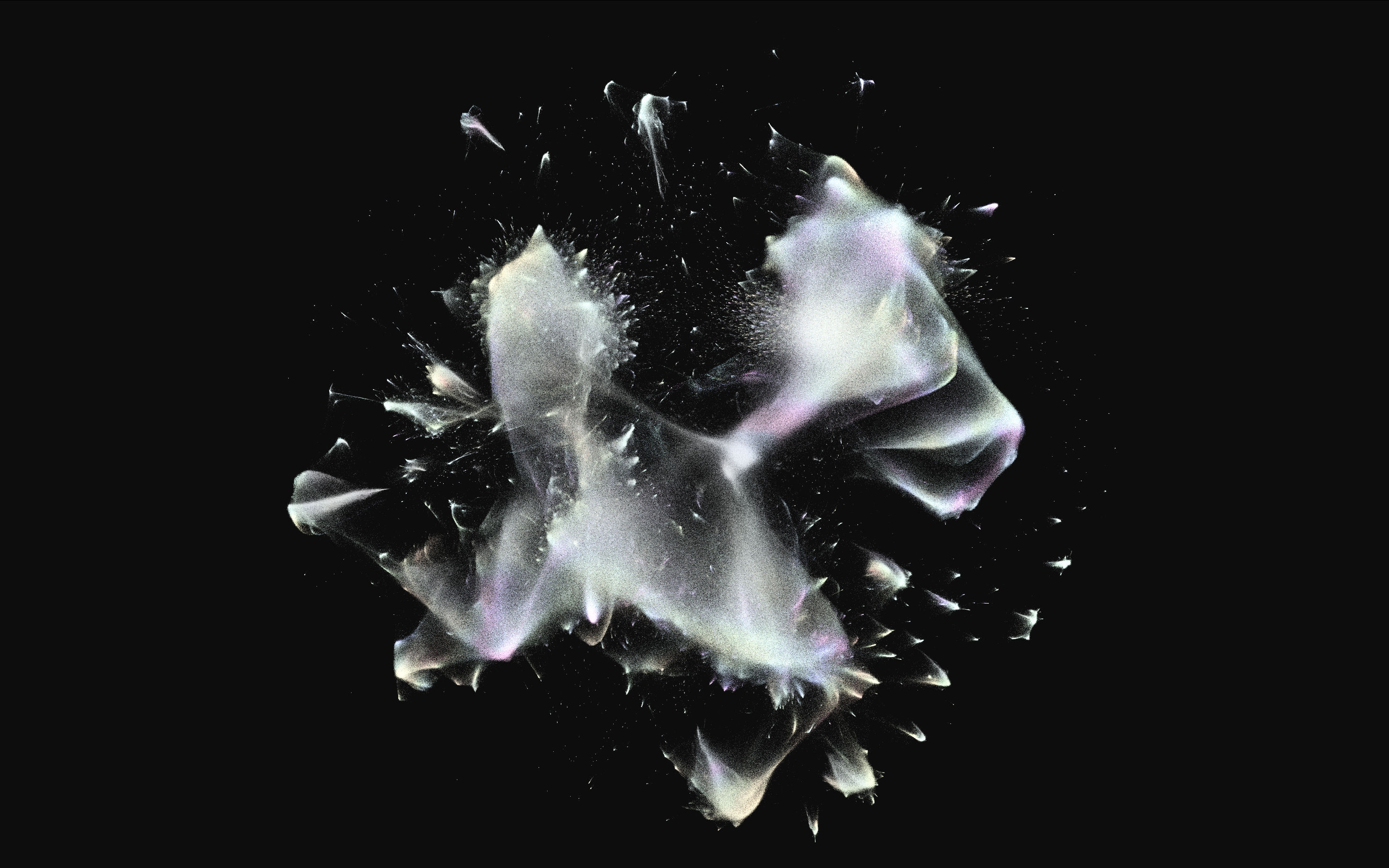
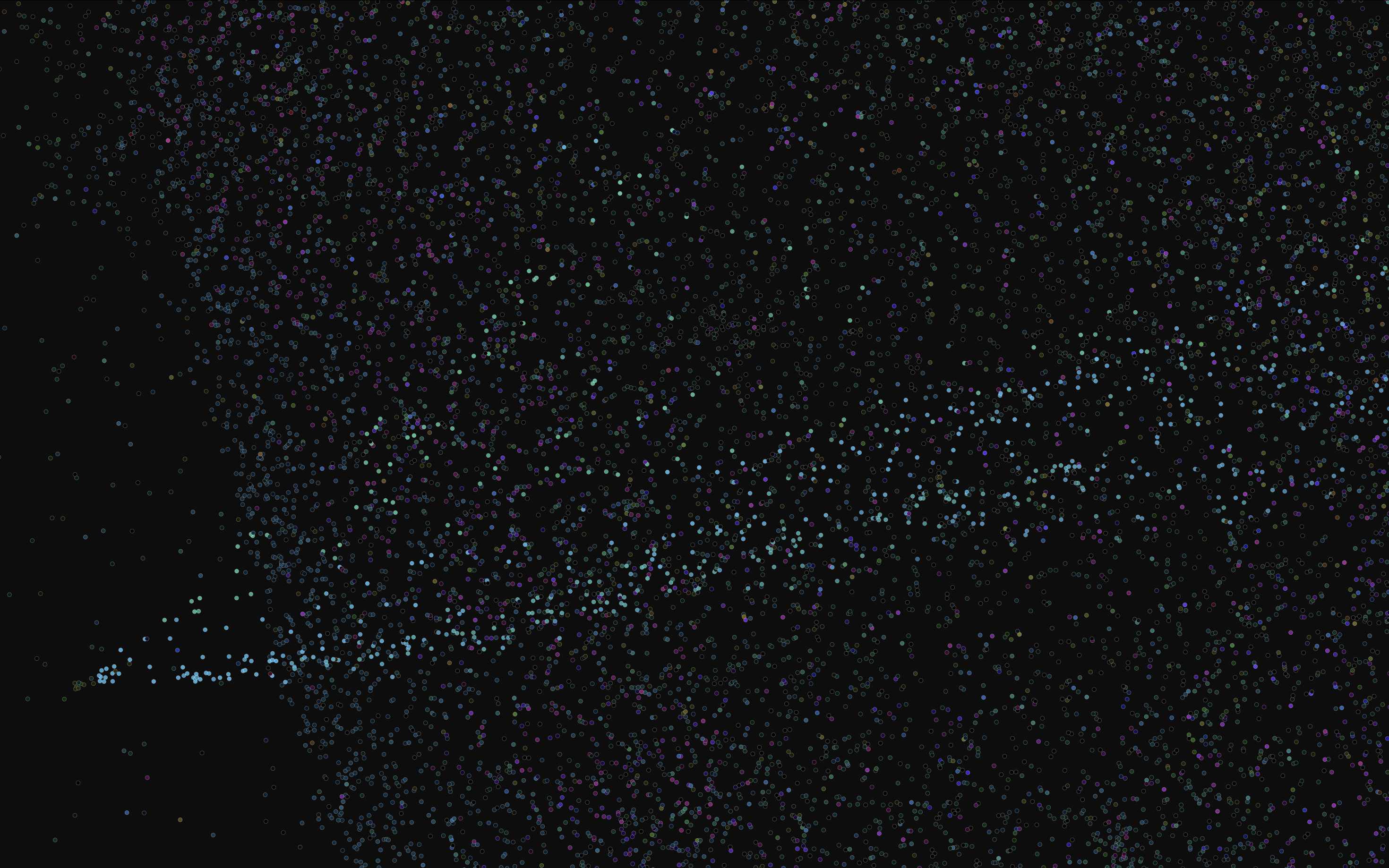
Here's a prominent streak of high-follower media/policy/commentary accounts, easily distinguished from the relatively urelated groups in the background.
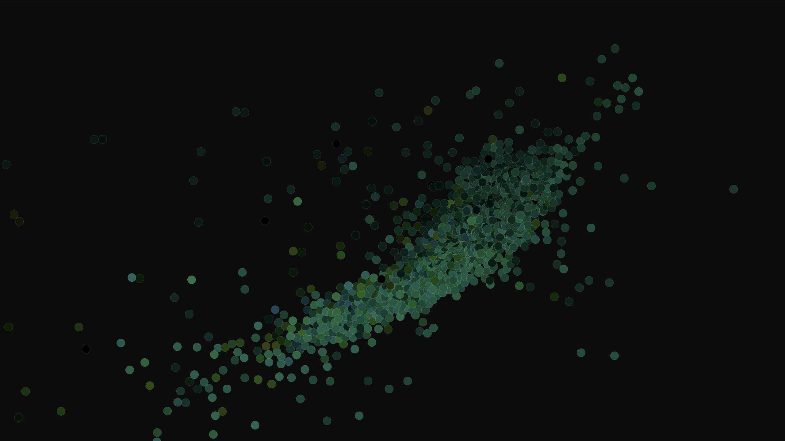
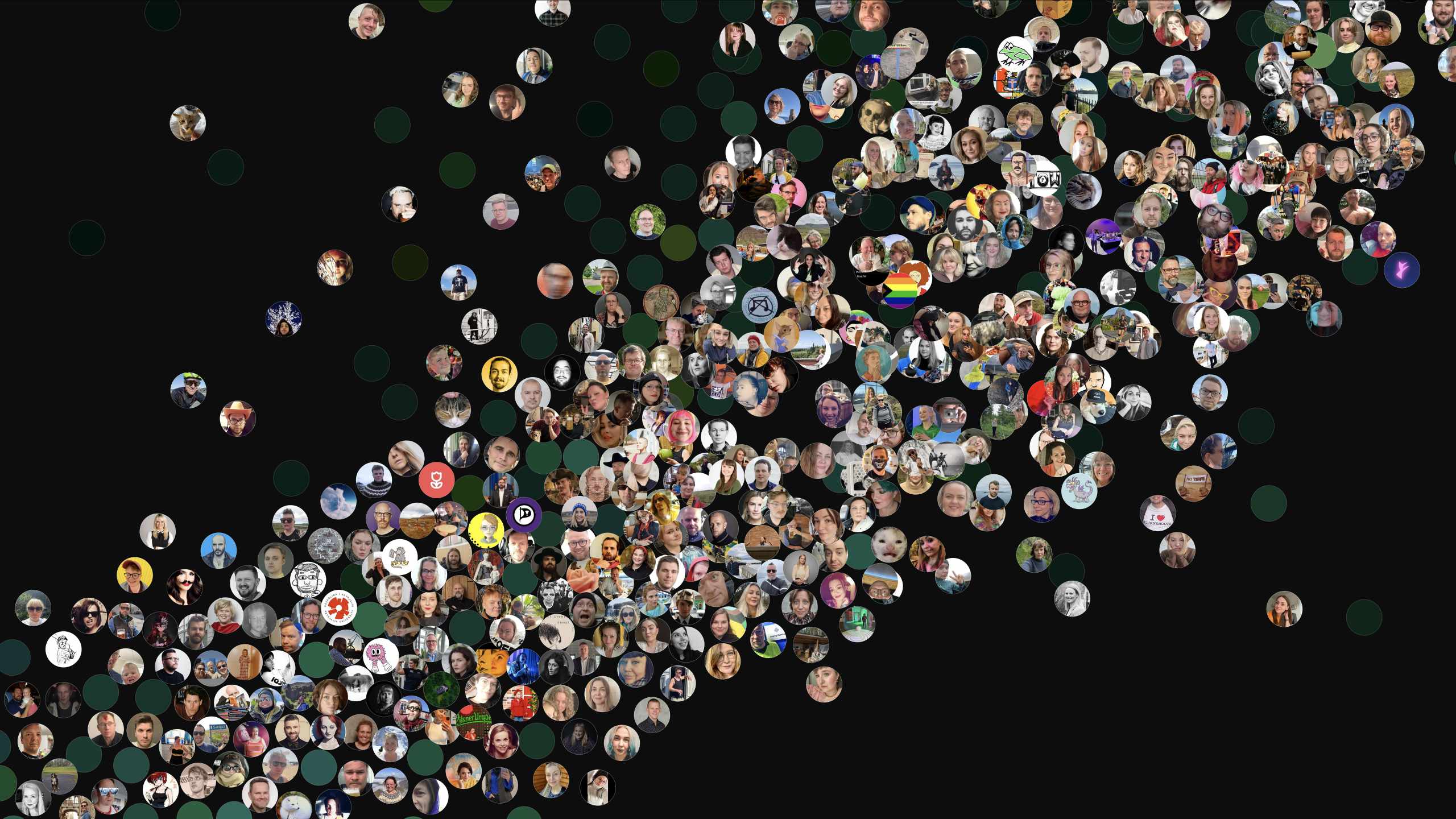
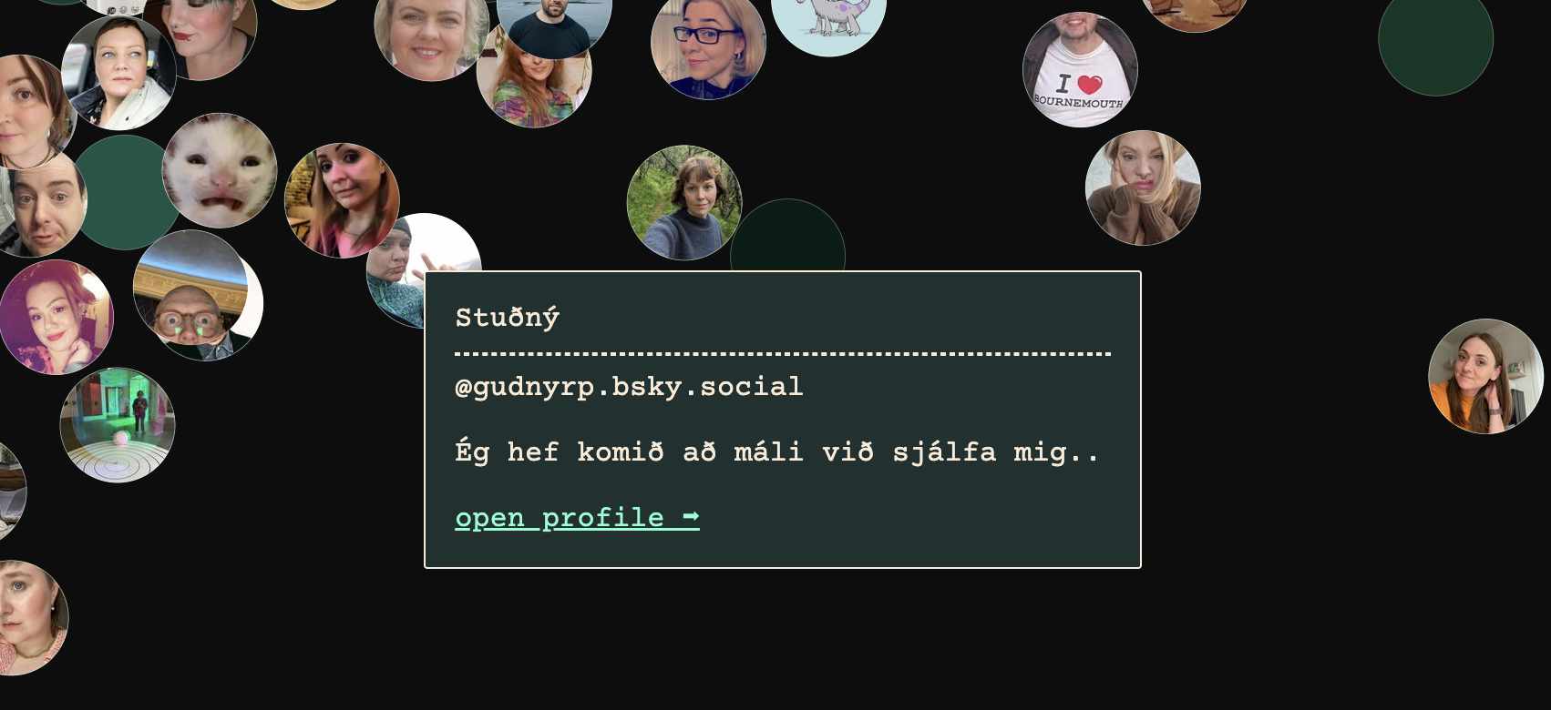
Here's the Icelandic cluster, first at a distance and then closer with profile pictures.
Neat!
There's a lot to learn from exploring the graph. Bot rings show up clearly exposed, for one. It creates a new kind of tourism, for better or worse, although not everyone in every community may be all that enthusiastic about this.
The next feature I'd like to add is a collapsible sidebar with a timeline of posts from just the accounts currently in view, so that you can easily check in on what the area you're looking at has been talking about. If you have other ideas let me know on BlueSky or Twitter; I'd love for this to be the beginning of a new kind of social/memetic exploration tool.